Troubleshooting Common Issues in Funeral Stationery Design
Introduction
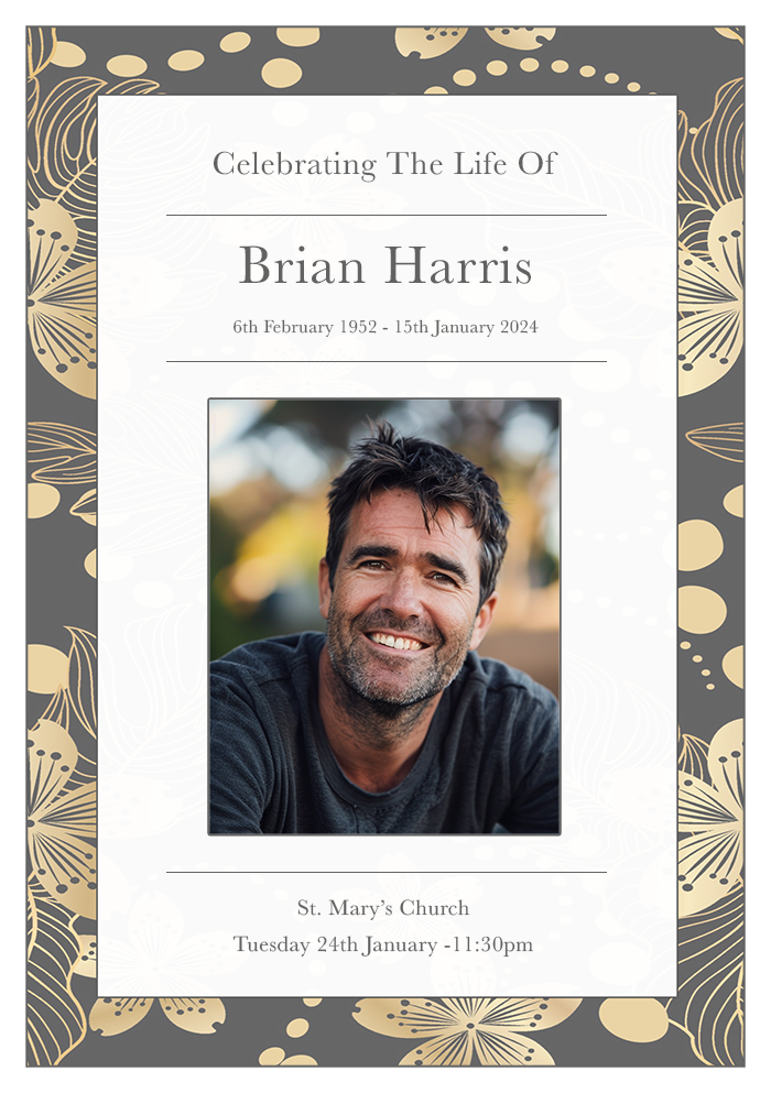
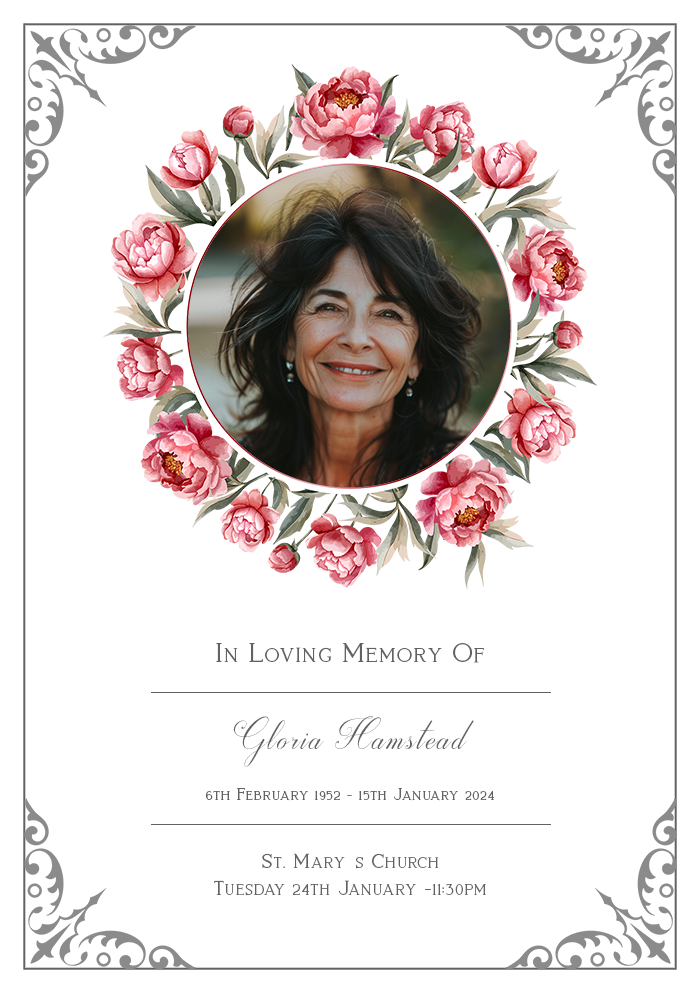
Losing a loved one is an incredibly challenging time, and organising a funeral can add further stress. Funeral stationery, while a small part of the process, plays a significant role in honouring and remembering the deceased.
Ensuring the stationery is well-designed and free from errors can provide comfort and create a lasting tribute.
This article will guide you through troubleshooting common issues in funeral stationery design, helping to create a respectful and beautiful farewell.
After reading the article please consider our collection of personalised order of service booklets.

Article Contents
Common Mistakes in Funeral Stationery Design
Typos and Spelling Errors
One of the most frequent issues in funeral stationery is typos and spelling errors. These can be particularly distressing when they involve the deceased’s name or key details of the service.
How to Avoid:
- Proofread Thoroughly: Have multiple people review the text to catch any errors.
- Use Spellcheck: Utilise software tools but don’t rely solely on them.
- Read Aloud: Sometimes hearing the words can help identify mistakes.
Incorrect Dates and Times
Errors in dates and times can lead to confusion and inconvenience for mourners.
How to Avoid:
- Double-Check Details: Confirm all dates and times with the venue and officiant.
- Clear Layout: Ensure dates and times are prominently displayed and easily readable.
- Final Review: Before printing, do a final check of all critical details.
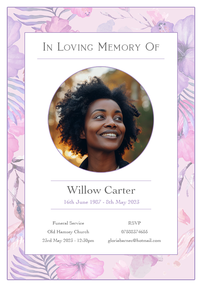
Poor Quality Images
Using low-resolution or inappropriate images can detract from the overall quality of the stationery.
How to Avoid:
- High-Resolution Photos: Use images that are at least 300 dpi for printing.
- Professional Scans: If using older photos, have them professionally scanned.
- Edit Carefully: Ensure photos are cropped and edited to fit the design without losing quality.
Unreadable Fonts
Fonts that are too ornate or too small can make the text difficult to read, which is particularly problematic for older attendees.
How to Avoid:
- Legible Fonts: Choose fonts that are clear and easy to read.
- Appropriate Size: Ensure the text size is large enough for comfortable reading.
- Contrast: Use high-contrast colours between text and background for better readability.
For more information on fonts and colours please see our article – Choosing Fonts and Colours For A Funeral Order Of Service Booklet: A Design Guide.
Colour Issues
Colour can convey emotions, and poor choices or inconsistencies can affect the tone of the stationery.
How to Avoid:
- Consistent Palette: Stick to a consistent colour palette that reflects the tone of the service.
- Colour Printing: Test print colours to ensure they appear as intended.
- Cultural Sensitivity: Be aware of cultural meanings associated with certain colours.
Technical Problems in Printing
Margins and Bleed
Incorrect margins and lack of bleed can result in text or images being cut off.
How to Avoid:
- Design with Bleed: Include a bleed area in your design to prevent cut-off issues.
- Check Margins: Ensure all important content is within safe margin areas.
- Print Previews: Use print preview functions to check layout before printing.
Paper Quality
The choice of paper can significantly impact the appearance and feel of the stationery.
How to Avoid:
- Sample Papers: Request paper samples to choose the best quality for your design.
- Appropriate Weight: Use a heavier weight paper for a more substantial feel.
- Finishes: Consider matte or glossy finishes based on the design and desired look.
Alignment Issues
Misalignment can make the stationery look unprofessional and rushed.
How to Avoid:
- Gridlines and Guides: Use design software tools to align text and images precisely.
- Test Prints: Do a few test prints to check alignment before the final print run.
- Professional Printing: Consider using a professional printer for the best results.
Design Aesthetics and Sensitivity
Overly Complex Designs
Complex designs can be overwhelming and detract from the message and tone of the stationery.
How to Avoid:
- Simplicity: Opt for simple, elegant designs that focus on clarity and respect.
- White Space: Use white space effectively to avoid clutter.
- Focus: Highlight key elements like the name, dates, and a photo of the deceased.
Inappropriate Imagery
Using inappropriate or overly personal imagery can upset some attendees.
How to Avoid:
- Respectful Images: Choose images that are respectful and suitable for all audiences.
- Consult Family: Involve close family members in image selection to ensure appropriateness.
- Generic Symbols: Use universally recognised symbols of mourning and remembrance.
Unbalanced Layout
An unbalanced layout can make the stationery look chaotic and unfocused.
How to Avoid:
- Symmetry: Strive for a balanced layout with symmetrical elements.
- Hierarchy: Create a clear hierarchy with font sizes and weights to guide the reader’s eye.
- Consistent Elements: Ensure consistent spacing and alignment throughout the design.
Digital Stationery Issues
File Formats
Using the wrong file formats can cause issues with printing and sharing.
How to Avoid:
- Print-Ready Formats: Save files in print-ready formats such as PDF with high resolution.
- Editable Files: Keep editable files in formats like PSD or AI for future adjustments.
- Sharing Formats: Use universally accepted formats like JPEG or PNG for digital sharing.
Resolution Problems
Low-resolution files can appear pixelated and unprofessional when printed.
How to Avoid:
- High Resolution: Ensure all images and elements are high resolution (300 dpi or higher).
- Scaling: Avoid excessive scaling of images to prevent loss of quality.
- Previews: Use print previews to check resolution before final printing.
Compatibility Issues
Different devices and software versions can cause compatibility issues.
How to Avoid:
- Standard Software: Use standard, widely-used design software.
- Cross-Platform Checks: Test files on different devices and software versions.
- Updates: Keep software updated to avoid compatibility problems.
Conclusion
Creating funeral stationery is a delicate task that requires attention to detail and sensitivity. By troubleshooting common issues such as typos, poor image quality, and printing problems, you can ensure the stationery is a fitting tribute to your loved one.
Remember, simplicity, clarity, and respect are key in these designs. Taking the time to carefully check every element will help you create a meaningful and beautiful memorial.