Popular Fonts for Funeral Stationery and How to Choose Them
Introduction
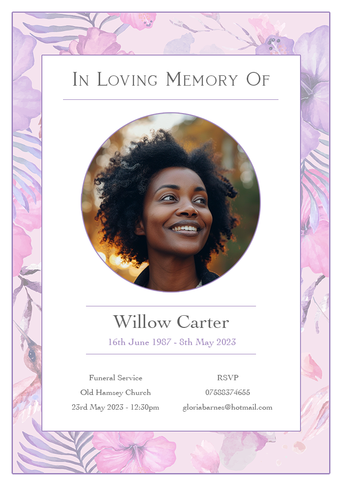
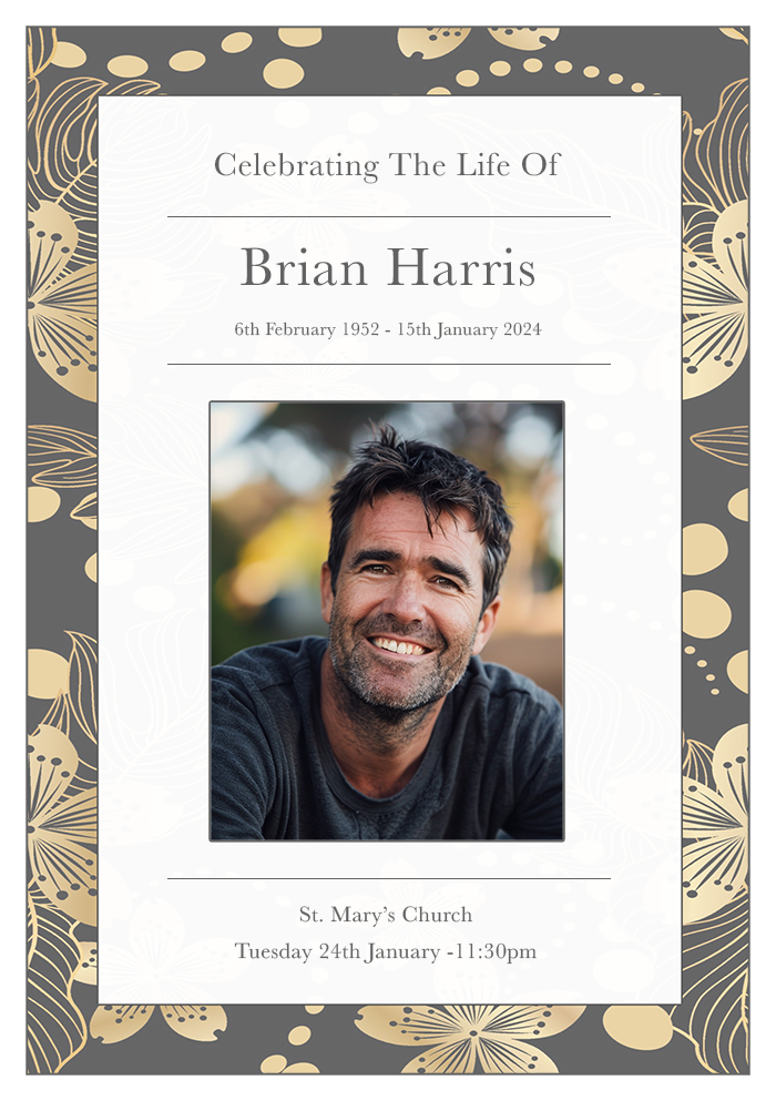
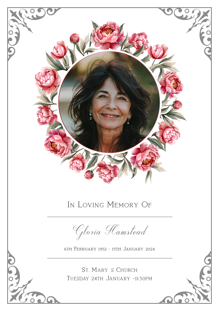
Losing a loved one is a profoundly difficult experience, and planning a funeral can be an emotionally taxing process. One important aspect of this planning is creating funeral stationery that honours the memory of the deceased with dignity and respect.
Choosing the right font for funeral stationery is crucial as it conveys the tone and sentiment of the occasion. In this article, we will explore some popular fonts, providing guidance on how to choose the most appropriate ones for funeral programmes, memorial cards, and other related stationery.
After reading the article please consider our collection of personalised order of service booklets.
Article Contents
The Importance of Choosing the Right Font
Fonts play a significant role in setting the tone of printed materials. For funeral stationery, the right font can evoke feelings of solemnity, comfort, and remembrance.
It’s essential to select fonts that are easy to read and appropriate for the occasion. The following sections will guide you through various font styles that can be used effectively in funeral stationery.
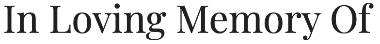
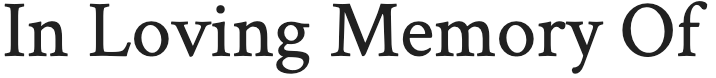
Serif Fonts: Timeless Elegance
Serif fonts are often associated with tradition and formality, making them a popular choice for funeral stationery. The small lines or strokes attached to the ends of the letters lend an air of sophistication and gravity.
Merriweather
Merriweather is a versatile serif font that combines readability with a traditional look. Its slightly condensed letterforms ensure it fits well on printed materials, even when space is limited.
This font’s design is soft and warm, providing a comforting feel that is appropriate for memorial materials.

Playfair Display
Playfair Display offers a classic yet elegant appearance, making it suitable for headings and titles in funeral stationery.
Its high contrast and beautiful italics add a touch of refinement, which can help convey the respect and admiration you wish to express for your loved one.
Crimson Text
Crimson Text is inspired by old-style typefaces and exudes a sense of timelessness and dignity. It is well-suited for body text in programmes and memorial booklets, offering excellent readability and a scholarly feel that honours the legacy of the departed.
Sans-Serif Fonts: Modern Simplicity
Sans-serif fonts, with their clean lines and lack of embellishment, provide a more modern and straightforward appearance. These fonts can convey clarity and sincerity, which can be comforting in times of grief.
Open Sans
Open Sans is a humanist sans-serif font known for its friendly and approachable look. Its readability at various sizes makes it a versatile choice for both headings and body text in funeral stationery.
This font’s clean design ensures that your message is conveyed with clarity and respect.

Lato
Lato’s semi-rounded details give it a warm and welcoming feel, suitable for funeral materials that aim to offer solace and peace. Its versatility makes it an excellent choice for different types of stationery, from invitations to thank-you cards.

Roboto
Roboto is a widely-used sans-serif font that combines geometric forms with open curves. This creates a natural reading rhythm that is easy on the eyes, making it ideal for longer texts in memorial booklets or funeral programmes. Its modern appearance can also be comforting to those looking for a more contemporary design.

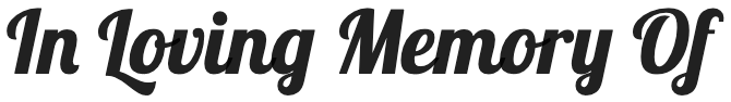
Script Fonts: Elegant and Personal
Script fonts mimic the flow of handwriting, bringing a personal and intimate touch to funeral stationery. They are particularly effective for headings, names, or quotes, where a touch of elegance and emotion is desired.
Great Vibes
Great Vibes is a beautifully flowing script font that adds a touch of elegance and formality to any stationery. Its smooth, connected strokes can be used for headings or significant quotes, ensuring they stand out with grace and beauty.

Dancing Script
Dancing Script offers a more casual yet graceful feel. Its lively and friendly appearance can provide a comforting note in memorial cards or thank-you notes, offering a sense of warmth and personal connection.

Pacifico
Pacifico is a bold script font with a retro, yet approachable feel. While not as formal as some other script fonts, it can bring a unique and heartfelt touch to headings and special sections of your funeral stationery.

Display Fonts: Impactful and Memorable
Display fonts are designed to attract attention and are best used sparingly, such as on covers or for important headings. They can add a distinctive character to your stationery.
Lobster
Lobster is a bold and condensed script font that stands out while maintaining a sense of elegance. It’s perfect for headings or the name of the deceased, providing a strong and memorable visual impact.
Cinzel
Cinzel is inspired by classical inscriptions and offers a majestic and dignified look. It’s suitable for titles and headings, adding a sense of grandeur and timeless respect to your stationery.

Abril Fatface
Abril Fatface is a bold display font that exudes confidence and strength. Its high contrast and dramatic presence make it ideal for highlighting key information or headings in funeral programmes and invitations.

Combining Fonts: Harmonious Pairings
Using a combination of fonts can create a visually appealing and balanced design. When choosing fonts to pair, ensure they complement each other in style and readability.
Merriweather and Open Sans
Pairing Merriweather with Open Sans combines the traditional elegance of a serif font with the modern simplicity of a sans-serif font. This combination works well for programmes, where Merriweather can be used for headings and Open Sans for body text.
Playfair Display and Lato
Playfair Display’s elegant and high-contrast design pairs beautifully with Lato’s clean and warm appearance. This combination is ideal for invitations or memorial booklets, providing a sophisticated yet approachable look.
Crimson Text and Roboto
Combining Crimson Text with Roboto offers a blend of classic and contemporary styles. Crimson Text can be used for more formal sections or quotations, while Roboto provides excellent readability for longer texts.
Conclusion
Selecting the right font for funeral stationery is a delicate task that requires thought and care. The fonts you choose should reflect the tone of the service and the personality of your loved one, while also ensuring readability and aesthetic harmony.
Whether you opt for the timeless elegance of serif fonts, the modern clarity of sans-serif fonts, or the personal touch of script fonts, each choice carries its own significance. By carefully considering your options, you can create beautiful and meaningful stationery that honours the memory of your loved one.