Choosing Fonts and Colours For A Funeral Order Of Service Booklet: A Design Guide

Introduction
Creating a funeral order of service booklet is a deeply personal and significant task. It’s an opportunity to honour and celebrate the life of a loved one while providing comfort to those who are mourning.
The design of this booklet should reflect the personality and spirit of the person being remembered, offering a fitting tribute that is both beautiful and functional.
In this guide, we will explore how to thoughtfully choose fonts and colours to create a respectful and heartfelt memorial booklet.
After reading the article please consider our collection of personalised order of service booklets.
Article Contents
Understanding the Purpose of the Order of Service Booklet
Before diving into design elements, it’s essential to understand the purpose of the order of service booklet. This booklet serves several key functions:
- Commemoration: It celebrates the life of the deceased, sharing their story, achievements, and memories.
- Comfort: It provides solace to the bereaved by offering a tangible memento.
- Guidance: It helps attendees follow the service, detailing the order of events, readings, hymns, and other important information.
With these purposes in mind, let’s explore how to choose the right fonts and colours to create a fitting and meaningful booklet.
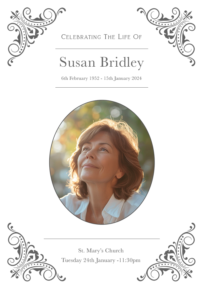
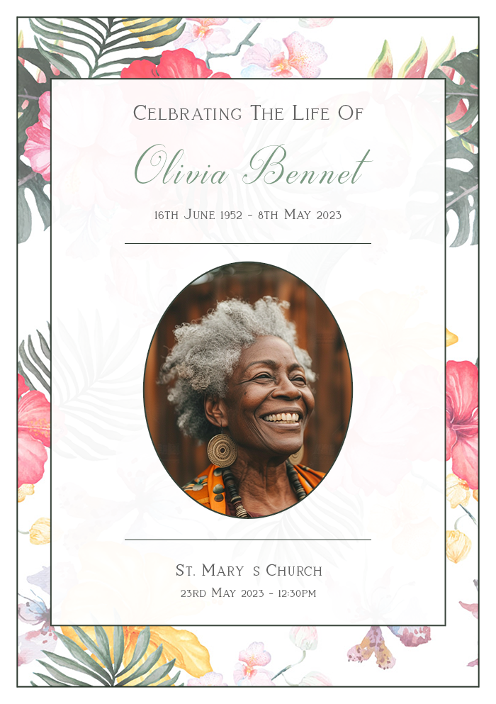
Choosing the Right Fonts
Importance of Font Choice
Fonts play a significant role in setting the tone of your booklet. The right font can convey a sense of dignity, warmth, and reverence. Here are some key considerations when choosing fonts for a funeral order of service booklet:
- Readability: Ensure that the text is easy to read. The booklet will likely be read by people of all ages, so clarity is paramount.
- Tone: Different fonts evoke different emotions. Select fonts that reflect the mood you wish to convey – whether it’s solemn, celebratory, or reflective.
- Consistency: Maintain consistency throughout the booklet to create a cohesive and professional appearance.
Recommended Font Families
Serif Fonts
Serif fonts have small lines or strokes at the ends of letters, giving them a classic and formal appearance. They are often used in printed materials and can lend a sense of tradition and respect to your booklet. Some recommended serif fonts include:
- Times New Roman: A timeless classic, it offers excellent readability and a formal tone.
- Georgia: Slightly more modern than Times New Roman, it is elegant and highly readable.
- Garamond: Known for its classic beauty and readability, it adds a touch of sophistication.
Sans-Serif Fonts
Sans-serif fonts lack the small lines at the ends of letters, giving them a clean and modern look. These fonts can convey simplicity and clarity. Some recommended sans-serif fonts include:
- Arial: A widely used, clean, and highly readable font.
- Helvetica: Known for its clarity and neutrality, it offers a professional appearance.
- Calibri: Modern and clear, it is highly readable and works well in various contexts.
Combining Fonts
Using a combination of fonts can add visual interest and help differentiate sections of the booklet. Here are some tips for combining fonts effectively:
- Limit Your Choices: Stick to two or three fonts to maintain a cohesive look.
- Pair Contrasting Styles: Combine a serif font with a sans-serif font to create a balanced and harmonious design.
- Use Hierarchy: Use different font sizes and weights to create a clear hierarchy, making it easy for readers to navigate the booklet.
Choosing the Right Colours
Importance of Colour Choice
Colours evoke emotions and set the overall mood of the booklet. Choosing the right colours can help convey the appropriate tone and provide comfort to those grieving.
Here are some key considerations when selecting colours for a funeral order of service booklet:
- Emotion: Different colours evoke different emotions. Choose colours that reflect the desired mood and the personality of the deceased.
- Readability: Ensure that there is sufficient contrast between the text and the background to make the booklet easy to read.
- Consistency: Maintain a consistent colour scheme throughout the booklet for a cohesive and polished look.
Recommended Colour Palettes
Neutral Colours
Neutral colours are timeless and versatile, making them a popular choice for funeral booklets. They convey a sense of calm and respect. Some recommended neutral colours include:
- White: Symbolises purity and peace, providing a clean and classic look.
- Cream: Offers a warm and gentle appearance, evoking a sense of comfort.
- Grey: Conveys sophistication and neutrality, providing a subtle backdrop.
Soft Pastels
Soft pastel colours can add a touch of warmth and personality to the booklet without being overwhelming. They can evoke feelings of serenity and grace. Some recommended pastel colours include:
- Light Blue: Symbolises tranquillity and calm, offering a peaceful vibe.
- Soft Pink: Conveys warmth and affection, adding a gentle touch.
- Lavender: Evokes feelings of calm and remembrance, providing a soothing effect.
Dark Colours
Dark colours can create a sense of depth and solemnity, making them appropriate for more traditional or formal services. Some recommended dark colours include:
- Navy Blue: Symbolises dignity and respect, offering a classic and formal appearance.
- Deep Green: Conveys peace and renewal, adding a touch of nature.
- Burgundy: Evokes a sense of reverence and formality, providing a rich and warm backdrop.
Combining Colours
Combining colours effectively can enhance the visual appeal of the booklet. Here are some tips for combining colours:
- Limit Your Palette: Stick to two or three main colours to maintain a cohesive look.
- Use Contrast: Ensure there is sufficient contrast between the text and the background for readability.
- Create Balance: Use colour to create visual balance, guiding the reader’s eye through the booklet.
Designing the Layout
Creating a Structured Layout
A well-structured layout ensures that the booklet is easy to follow and visually appealing. Here are some tips for creating a structured layout:
- Use Grids: Grids help organise content and create a balanced design.
- Break Up Text: Use headings, subheadings, and bullet points to break up large blocks of text.
- Include White Space: White space helps prevent the booklet from feeling cluttered and makes it easier to read.
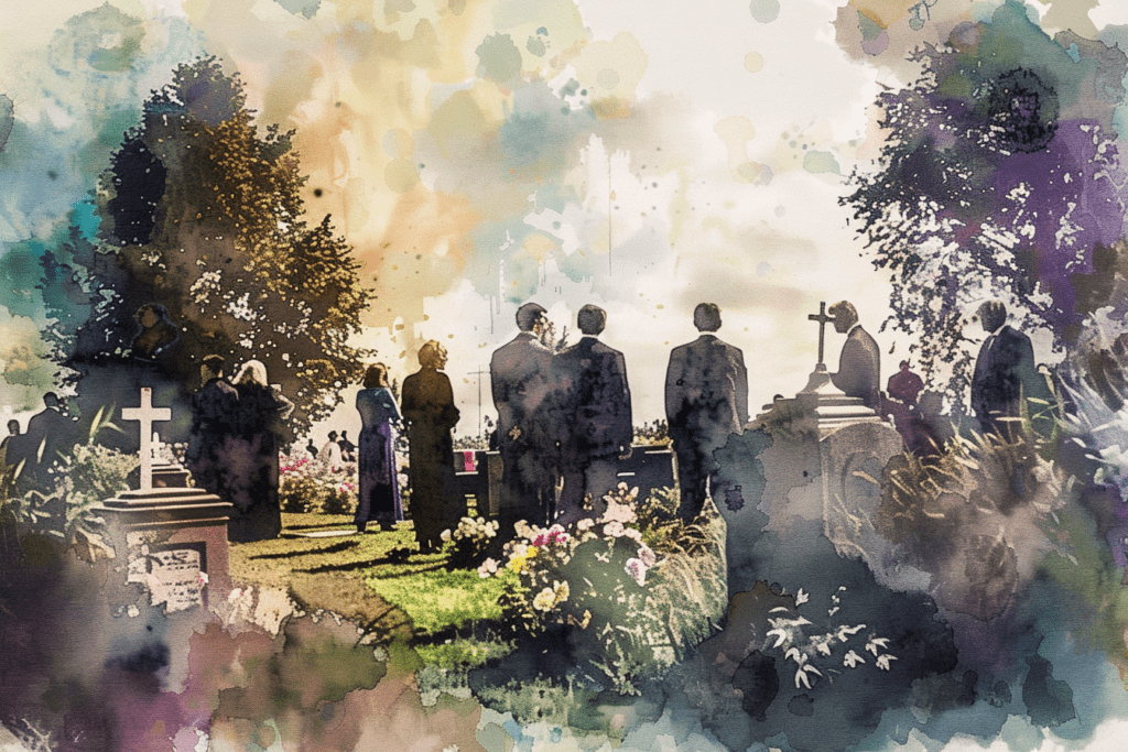
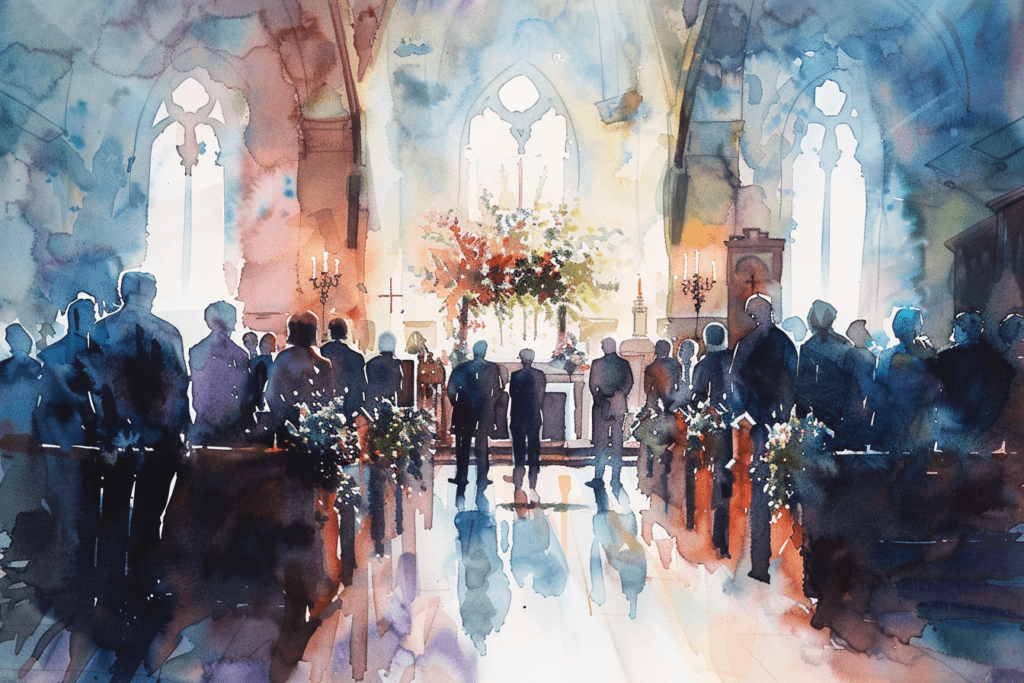
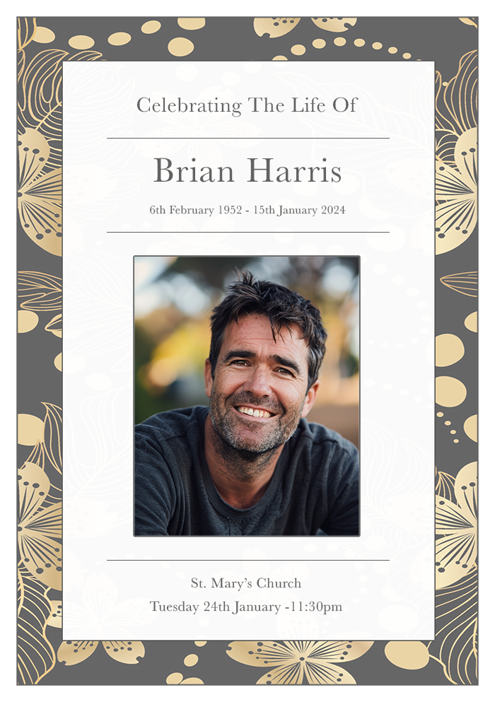
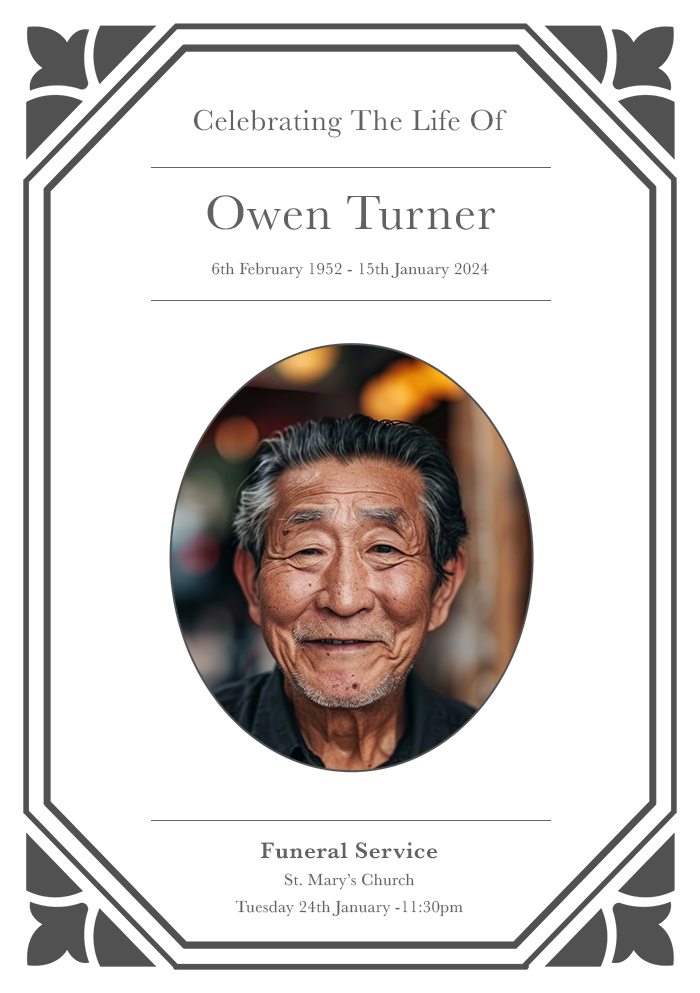
Incorporating Images
Images can add a personal touch and enhance the visual appeal of the booklet. Here are some tips for incorporating images:
- Choose Meaningful Images: Select images that are meaningful and reflect the personality of the deceased.
- Use High-Quality Images: Ensure that the images are high resolution and clear.
- Balance Text and Images: Maintain a balance between text and images to create a cohesive and harmonious design.
Adding Decorative Elements
Decorative elements can add a touch of elegance and enhance the overall design. Here are some tips for adding decorative elements:
- Use Borders: Borders can frame the content and add a formal touch.
- Incorporate Lines: Lines can separate sections and guide the reader’s eye.
- Add Simple Graphics: Simple graphics, such as floral designs or symbols, can add visual interest without overwhelming the design.
Printing and Paper Choices
Selecting the Right Paper
The choice of paper can significantly impact the overall look and feel of the booklet. Here are some tips for selecting the right paper:
- Consider the Finish: Choose between matte, glossy, or textured finishes based on the desired look.
- Choose the Right Weight: Heavier paper provides a more substantial and professional feel.
- Opt for Quality: High-quality paper ensures that the booklet looks and feels polished.
Printing Tips
Here are some tips for ensuring the best printing results:
- Use High-Resolution Files: Ensure that all images and graphics are high resolution to avoid pixelation.
- Proofread Thoroughly: Double-check for any typos or errors before printing.
- Test Print: Do a test print to ensure that the colours and layout look as expected.
Conclusion
Creating a funeral order of service booklet is a heartfelt way to honour and remember a loved one. By thoughtfully choosing fonts and colours, you can create a beautiful and meaningful tribute that provides comfort to those grieving.
Remember to prioritise readability, maintain a consistent design, and choose colours that reflect the personality of the deceased. With careful attention to detail, your booklet will serve as a cherished memento and a fitting tribute.